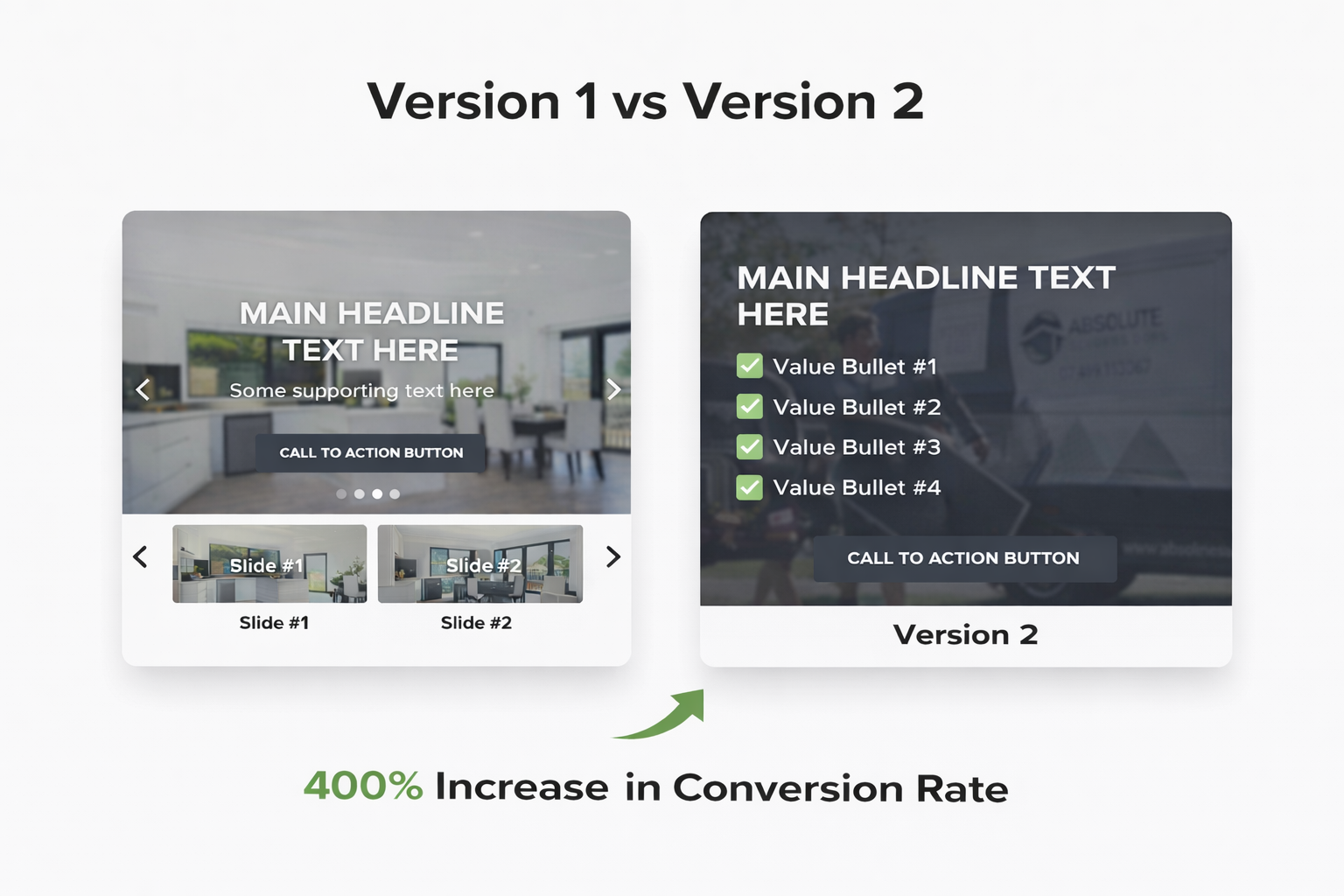
We recently ran a conversion rate optimisation experiment on a client’s homepage, focusing purely on the hero section — the very first thing visitors see.
Nothing fancy. No redesigning the whole site. Just a simple A/B test.
The outcome?
A 400% increase in conversions from one small but intentional change.
So what did we actually do?
First, we removed the slideshow. While sliders can look nice, they often distract users and dilute the main message. Most visitors don’t wait for slide two or three — they scan and move on.
Next, we replaced it with a single, strong hero image. One clear visual, aligned with the customer’s problem and the outcome they’re looking for. This immediately made the page feel more focused and easier to understand.
Finally, we added clear value bullets and social trust. Instead of talking about features, we highlighted benefits — what the customer actually gets. We backed that up with trust signals to reduce hesitation and build confidence.
The result was a page that answered three questions instantly:
What is this?
Is it for me?
Can I trust it?
That’s the real takeaway here.
Conversion rate optimisation isn’t about gimmicks or guessing. It’s about clarity. When users understand the value straight away, they’re far more likely to take action.
Simple changes. Measurable results.
Test > learn > improve.
If you’re not testing, you’re leaving growth on the table.